404 Page Design

The 404 page is likely the one page your readers are never supposed to encounter— a digital dead end that, paradoxically, offers a unique opportunity for reconnection. Even though the user’s arrival on a 404 page is always ‘unintended,’ stemming from a broken link or error, it presents a singular chance to showcase your brand’s human side.
In this article, we’ll help you get a handle on this most underrated of pages, spill the tea on its non-negotiables, and parade an ensemble of its cleverest, quirkiest, and most inspiring incarnations. So, buckle up, and let’s turn your 404 from a faceless error message into your brand’s unsung hero!
Table of Contents
Demystifying the 404 – More than Just an Error
It might look like the internet’s equivalent of an ‘Out of Order’ sign—annoying, inconvenient, and forgettable, but when properly employed, your website’s 404 page can pack a peculiar punch.
Although its primary function is to signal a missing or moved page, a 404 error can offer much more. Thoughtfully designed, it can serve as a key interaction point on your website, enriching the user’s overall experience.
Crafting the Ideal 404 & Turning Missteps into Opportunities
The Default Disposition
At first glance, a standard 404 page seems starkly minimalist, almost clinical. A barren white space with the blunt message ‘404 Not Found’. It succinctly communicates the core message—missing the desired page—but it lacks warmth, engagement, and design intentionality.
A 404 page isn’t just about aesthetics either; it’s a statement. A well-designed 404 tells your audience, ‘We anticipated this, and we care enough to craft this unexpected moment into an experience for you.’
Navigation is Key
A key component of an effective 404 page is user-friendly navigation. Consider how you’ll guide the user from where they are to where they want to go. Make it simple for them to retrace their steps and, at the same time, offer opportunities to explore new branches. A strategically positioned search bar can also be invaluable, allowing them to find desired content without returning to the homepage.
Relevant Redirects
Consider the kinds of redirects you want to offer alongside the main navigation. Link to your most popular or relevant pages, showcase recent blog posts, or other significant site sections. Perhaps show trending topics, new products, or a random fun fact. Either way, find ways to transform this error space into a value-add-on.
Technical Touches
A great 404 page isn’t just about design and navigation; it’s also about performance. Preload key assets to ensure the page loads swiftly, and employ responsive design practices to ensure your 404 page is optimized for all screen sizes.
A Look at Great 404 Page Examples
Some brands elevate the unexpected 404 error into an art form, crafting experiences that are memorable, imaginative, and occasionally even inspiring. These standout pages redirect users while encapsulating a brand’s essence, wit, and commitment to an exceptional user experience.
To curate this section, we’ve sifted through a myriad of 404 pages. Our goal was to handpick ten exemplary designs that resolve the 404 error gracefully and go above and beyond in offering an engaging user experience.
Hopefully, these chosen pages can be a source of inspiration in helping you elevate your own 404 page design.
Zhenya Rynzhuk – Happy Animations
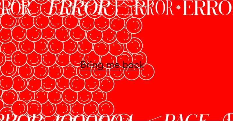
Zhenya Rynzhuk is an art and interactive designer and her 404 page is a playful extension of her brand. Bright, fluid, and instantly engaging, the interactive emojis react to user mouse and touch input by moving around the screen. It’s simple, and beautifully executed.
The error message is evident, and a single, powerful CTA—’ Bring me back’—offers seamless navigation back to the homepage. Additionally, the page performs flawlessly across devices and adds a layer of uniqueness with its interactive elements.
Pixar – Super Cute Branding
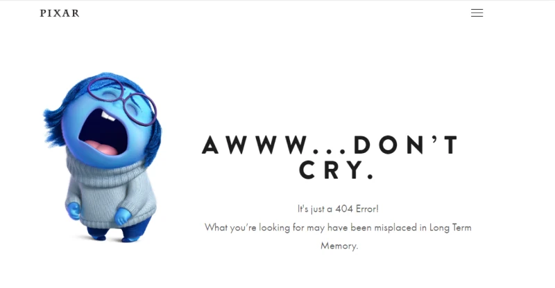
Pixar’s masterful blend of humor and minimalist white space, is punctuated by a singular character image, in the companies signature style. It effortlessly epitomizes the company’s expertise in design and animation adds a simple humorous element to the page.
The error message is intentionally small, reducing its importance in favor of the humorous reassurance of ‘Aww…Don’t Cry.’ The site maintains its overall navigation but doesn’t offer any additional interactivity. On the whole, the page performs flawlessly across devices without pushing any artistic or technical boundaries.
Dribble – Outstanding Creativity
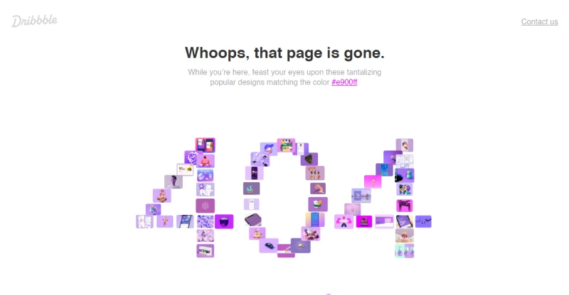
Dribbble’s 404 page uses a clever color-changing animation controlled with an interactive slider that turns an error disappointment into a fun visual treat. The color-centric theme remains true to Dribbble’s essence and the inclusion of the color Heex code above adds a nice practical touch.
The error message is straightforward, but unclear navigation hampers the page slightly. However, the design collage and color slider offer alternative engagement paths, and the search bar adds further utility. The interactive color slider is a fresh touch, highlighting Dribbble’s innovative approach and its role as a meeting place for designers and brands.
Dashthis – Product Led 404 Error Message
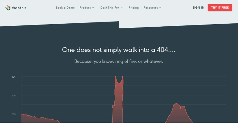
The Dashthis 404 cleverly integrates the look and feel of the company’s marketing dashboard product with a widely popular Lord of the Rings meme, creating a simple and memorable 404 that encapsulates the company’s identity and signature style.
Navigation is well executed, maintaining access to the entire site while adding a few helpful redirects. The page is responsive, fast, and works well on both desktop and mobile.
Code Academy – 404 Platformer
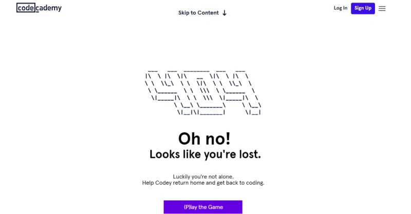
CodeAcademy’s 404 might be one of the most addictive 404’s ever devised. By incorporating a simple nostalgic platform game it both encapsulates the brand’s learning-to-code ethos and adds a ton of interactivity, making the 404 almost a destination of its own!
Full navigation is maintained alongside a clever CTA encouraging users to sign up for the Code Academy platform. The page is responsive, works well on desktop and mobile, and wins huge points for being both innovative and fun. Finding a 404 that feels like a bonus is rare, but Code Academy has achieved that balance here.
Steve Lambert – The Most Awkward 404
Steve Lambert's 404 Page Video from Steve Lambert on Vimeo.
Steve Lambert’s 404 is an exceptionally clever branding exercise disguised as 5 minutes of excruciatingly awkward geek comedy. The embedded video consists of Lambert wandering in-screen and then mumbling good-natured conversational generalities at his audience for a good five minutes. It’s a very funny and highly engaging take on a 404 page.
The site doesn’t sacrifice navigation in the slightest, and Lambert himself gestures awkwardly in the direction of various menus throughout the presentation, reminding his audience of the range of content on the site and inviting them to explore alternative avenues.
Mailchimp – The Silliest Minigame
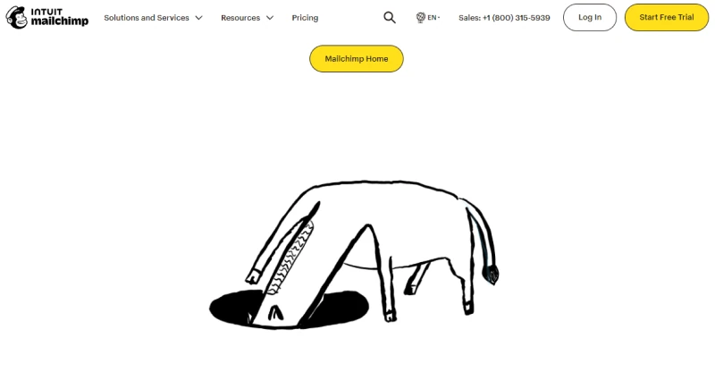
MailChimp’s 404 encapsulates its brand identity perfectly. The image chosen is a piece of handdrawn line art depicting a horse with its head down a hole. Interacting with the hole, takes you to a rather amusing minigame Mailchimp have named ‘ Horsnesnake.’ It’s all rather silly but it’s guaranteed to lighten your mood should you accidentally arrive on the page.
Navigation is preserved, and adding the hidden minigame is a nice touch —one that makes the page feel more like a discovery than a hindrance. Flawless performance across devices and a few extra points for being willing to try something silly.
The Australian – Best News 404
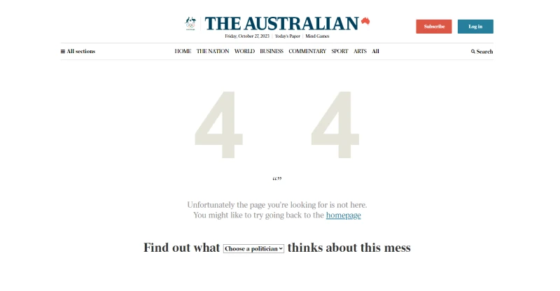
The Australian has come up with a witty take on a 404, peopling its page with silly but entirely believable quotes from various Australian politicians all offering their apologies for your broken link difficulties.
A drop-down menu allows you to toggle between various political figure, and the page generates a new random quote each time you visit. All of the site’s main navigation is intact. A drop-down joke page isn’t innovative in and of itself, but it’s a nice touch by the Australian to employ subtle satire for its already political readership.
Dan Woodger – One Man Brand
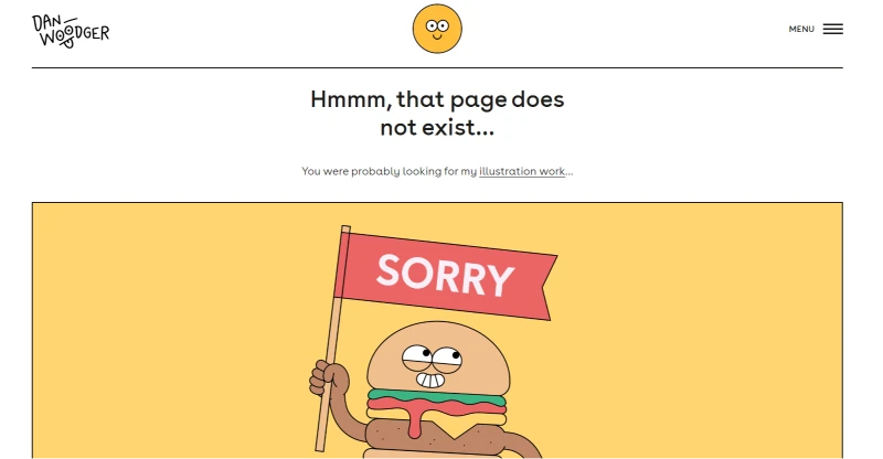
The 404 of illustrator and animation director Dan Woodger is a perfect synergy of brand and function. For fans of his work, a simple, playful character based on ‘Sorry’ may be all they need to brighten their day. A slight scroll reveals the error message and a further bee and flower illustration pops into view below adding a further personal touch.
Figma- The Minimalist 404
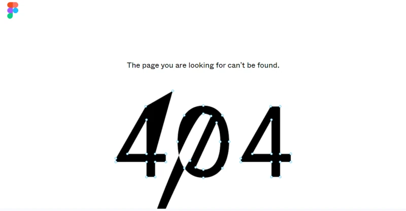
Figma’s 404 is a clever exercise in brand minimalism. At first glance, it features nothing except a black 404 error message. Look closer, and you’ll see that the page features a series of anchor points allowing you to drag and deform the type. It’s an apt choice for a brand focused on design and prototyping.
Navigation isn’t the strong suit of this 404. Figma has provided a clickable logo in the top left, that redirects to the main page but it’s perhaps a little obscure. The page may not suit all tastes, but Figma has made a stylistic choice here that they feel will resonate with their design-conscious audience.
Designing Your 404 Error Page Recap
From Zhenya Rynzhuk’s interactive emojis to Code Academy’s nostalgic platformer, we’ve seen that 404 pages can be both a playground for creativity and an opportunity to do something unexpected.
Whether you want to showcase your brand identity with a clever color changing CSS palette like Dribble, or explore the awkward conversational silliness of the error page like Steve Lambert, anything is possible as long as it resonates with your audience and truthfully reflects your brand.
Striking the Balance Between Navigation and Engagement
However, it’s important to remember that a great 404 page must also offer clear navigation options, allowing users to easily return to more fruitful pastures. Teh design of a 404 is about the balance between capturing attention, offering an apology and redirection and doing something surprising and delightful.
Moreover, don’t overlook the technical aspects. Ensure that your 404 page is responsive and quick to load, regardless of the device your audience is using.
The 404 page is a microcosm of your brand’s broader user experience strategy. It’s a small but significant touchpoint that speaks volumes about how much you value user interaction—even when things go awry.
So the next time you dive into web development or design, give your 404 page some dedicated attention.

Written by John Buckley
A writer and creative media producer, John explores the intersection of technology and human identity, leveraging AI tools for artistic and meaningful storytelling and delving into the ethical implications of a rapidly evolving digital landscape.


